Rayah
ADEK
One app for a parent's whole relationship with their child's education in Abu Dhabi: choosing a school, following progress, and finding support, in one place.
- Role
- Product designer, Rayah design team
- Organisation
- ADEK, Rayah parent app
- Timeline
- Multi-year, until Rayah moved into TAMM
- Platform
- iOS and Android app, web landing page, English and Arabic
- Users
- Parents, guardians and guests exploring schools
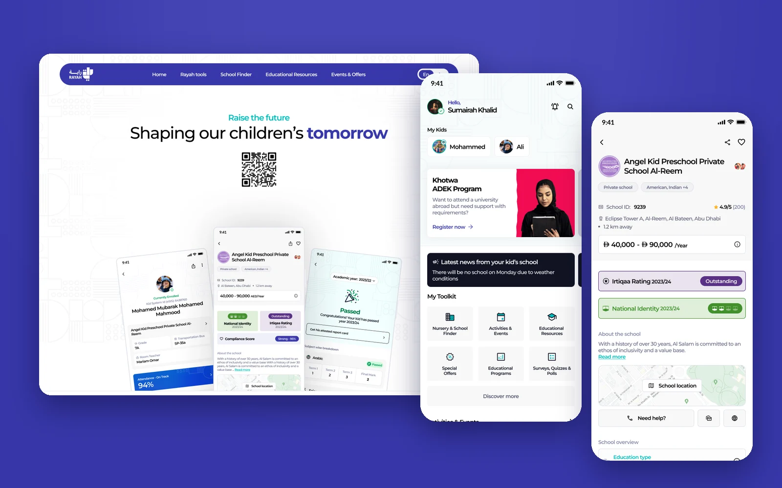
Overview
Rayah was ADEK's app for parents, built on a simple promise: turning the parenting journey into a digital experience. A parent could find and compare nurseries and schools, see their children's reports, assessments and attendance, discover events and offers, and find licensed tutors and specialists.
It was a large product with a long life. The file alone holds 76 pages, organised into general, parent, core and kids modules, with current and enhanced versions side by side. My work was the enhancement: taking features that had grown one by one and making them clear, consistent and honest about data, from the first sign-up screen to the day Rayah moved into TAMM.
What I owned
- Sign-up and sign-in paths for UAE PASS, email, Emirates ID and non-residents, with guest, unverified and verified states.
- The home dashboard and the More section redesign, including its problem framing and categorisation.
- School finder: list, search, filters, school detail, fee breakdown, and the Irtiqaa and National Identity ratings.
- The kids module: kids list, add kid, kid dashboard, benchmark assessments, academic report and attendance.
- Tools and services: events, notifications, tutors and specialists, the web landing page, and the Rayah to TAMM decommission notice.
Parents do not want data about their children. They want to know, in one glance, whether their child is doing well and what to do next.
Objectives → Design framing
How might a parent compare schools on what matters, from fees to inspection ratings, without reading official reports?
How might assessments, report cards and attendance tell a parent how their child is doing, not just show numbers?
How might the same app serve a guest exploring schools, a new resident, and a parent of four enrolled children?
Key constraints & tradeoffs
Enrolment, assessments, reports and attendance come from eSIS and school systems. Designs had to handle missing, partial, locked and in-progress data gracefully.
What a parent can see depends on verification: guests, unverified accounts and verified parents each needed their own version of every screen.
Irtiqaa inspection results, National Identity marks and compliance scores are official. They had to be accurate and still understandable to any parent.
Every screen was designed in both languages, across native and Flutter builds, with device security blockers and forced updates handled.
How objectives translated to features
The old screen organised results by subject and never said which test they came from. Parents could not see history, and the overall result looked tied to one subject.
Design decisions- Desk research and the real API response showed each school follows one assessment type, so the test (for example ACER IBT or NWEA MAP) and its dates lead the screen.
- Results over time as a chart per subject, with a current-year rating like Advanced Performer in plain words.
- Comparison with the emirate, same region, same curriculum and same fee category, chosen from one control.
- A full page instead of a bottom sheet, with a story-style explainer and a guided tutorial for parents new to benchmark assessments.
A full page is heavier than a bottom sheet. Benchmark assessments have too many parts for a sheet, and the first iteration proved it.
Solution
Chapter 1
A front door for every parent.
Rayah had to welcome people at very different stages: a newcomer exploring schools, a parent who has not verified yet, and a verified parent with children enrolled.
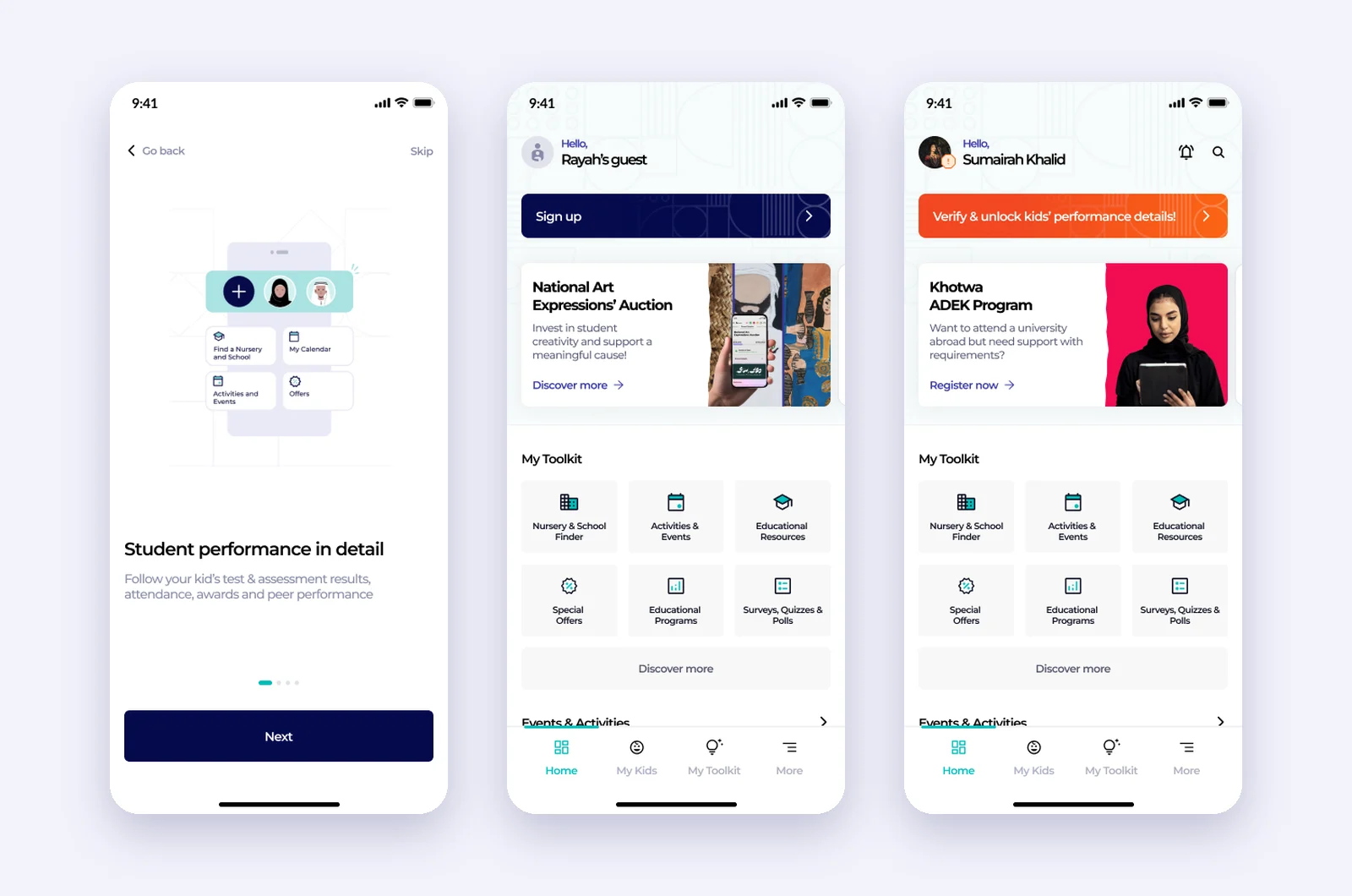
Guest, unverified, verified
Onboarding, a guest home and an unverified home.
Onboarding explains what Rayah does in a few slides. Guests land on a home with the toolkit and a sign-up prompt; unverified parents see the same home with a clear call to verify and unlock their kids' performance details.
- Walkthrough before sign-up
- Guest mode with the full toolkit
- Verify to unlock kids' records
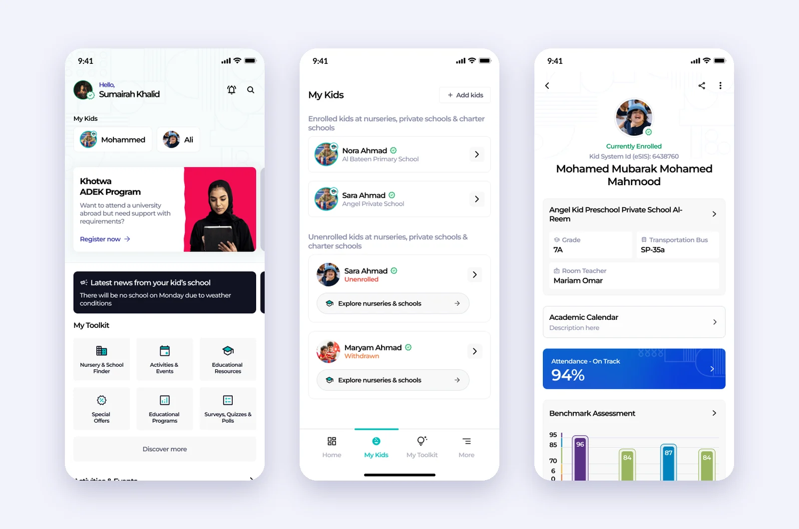
Home and the kids in one place
Dashboard, my kids and a kid's page.
The verified home greets the parent with their kids at the top, school news, the toolkit and programmes like Khotwa. My Kids separates enrolled from unenrolled children, and each child has a page with school, grade, teacher, attendance, assessments, report card, BMI and awards.
- Kids first on the home screen
- Enrolled, unenrolled and withdrawn states
- Everything about one child on one page
Chapter 2
Choosing a school, with evidence.
The school finder turns official data into a decision a parent can make: which nurseries and schools fit their child, what they cost, and how they were rated.
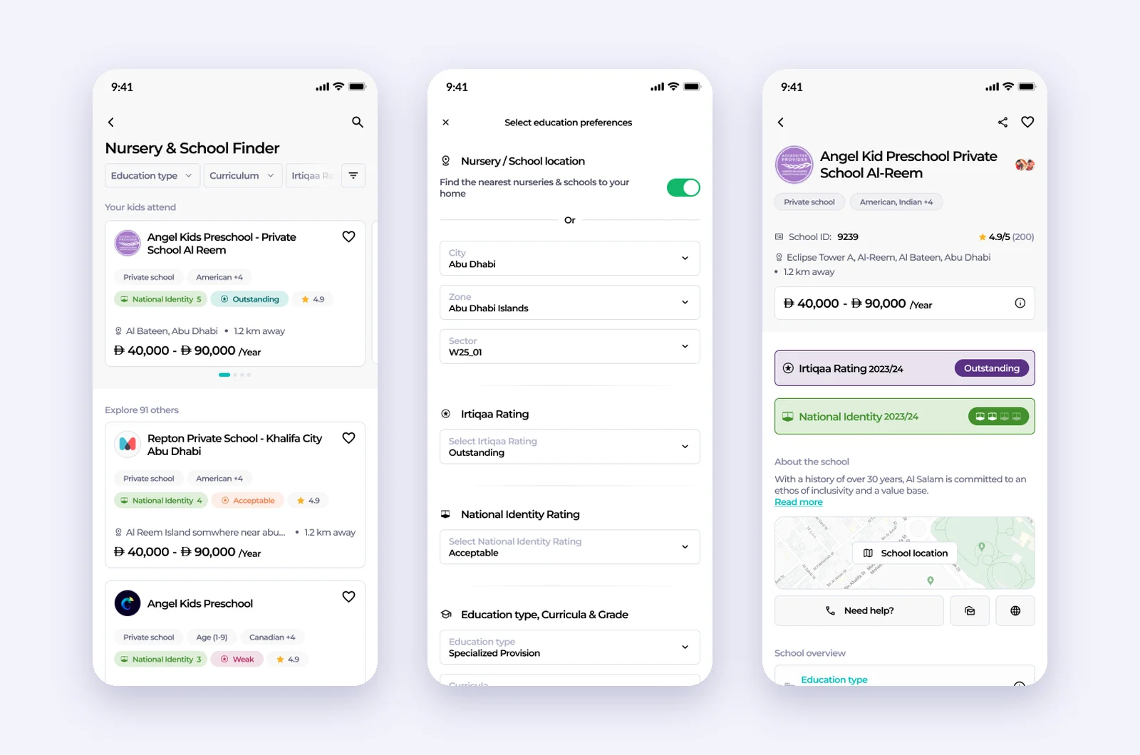
Find, filter, compare
Nursery and school finder, filters, school detail.
The list leads with the schools a parent's kids already attend, then everything else. Each card shows type, curricula, ratings, distance and fees. Filters cover location, ratings, curricula, grade, fee range, gender and facilities, and the school page brings the Irtiqaa and National Identity results to the top.
- Ratings visible on every card
- Every filter in one sheet
- Ratings dated by academic year
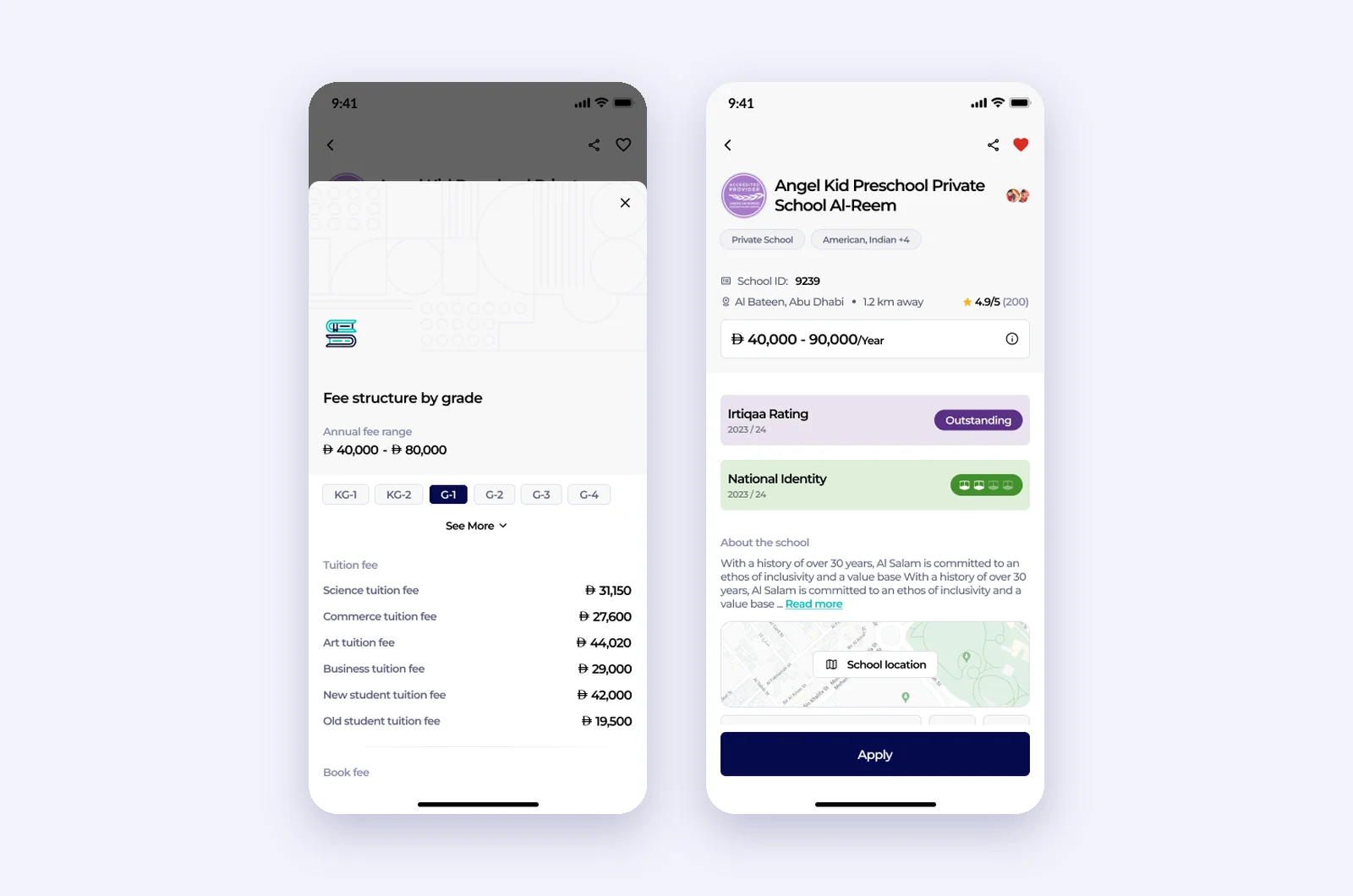
Fees and ratings, spelled out
Fee structure by grade, and the school detail page.
The fee sheet shows the annual range and every fee for the selected grade, from tuition to books. The school page pairs the Irtiqaa and National Identity results with the school's story, location and a way to get help or apply.
- Fees per grade, line by line
- States for missing tuition data
- Help and apply from the same page
Chapter 3
Making assessments make sense.
Benchmark assessments were the hardest screen in the app. The redesign started with a problem statement, desk research and the real API data, then went through three concepts before the final design.
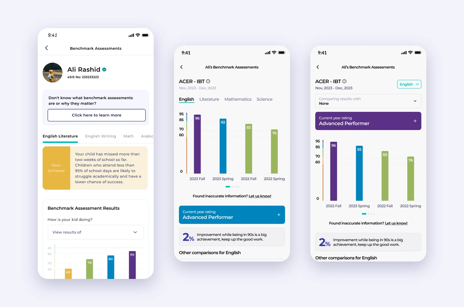
From tables to a story
The old screen, a concept, and the final design.
The old design put subject tabs and a table first. The concepts moved the test type and its dates to the top and added a plain-language current-year rating. The final design adds a comparison control and keeps the chart per subject over time.
- Test type and dates lead the screen
- A rating in words, not only a number
- Comparison chosen, not forced
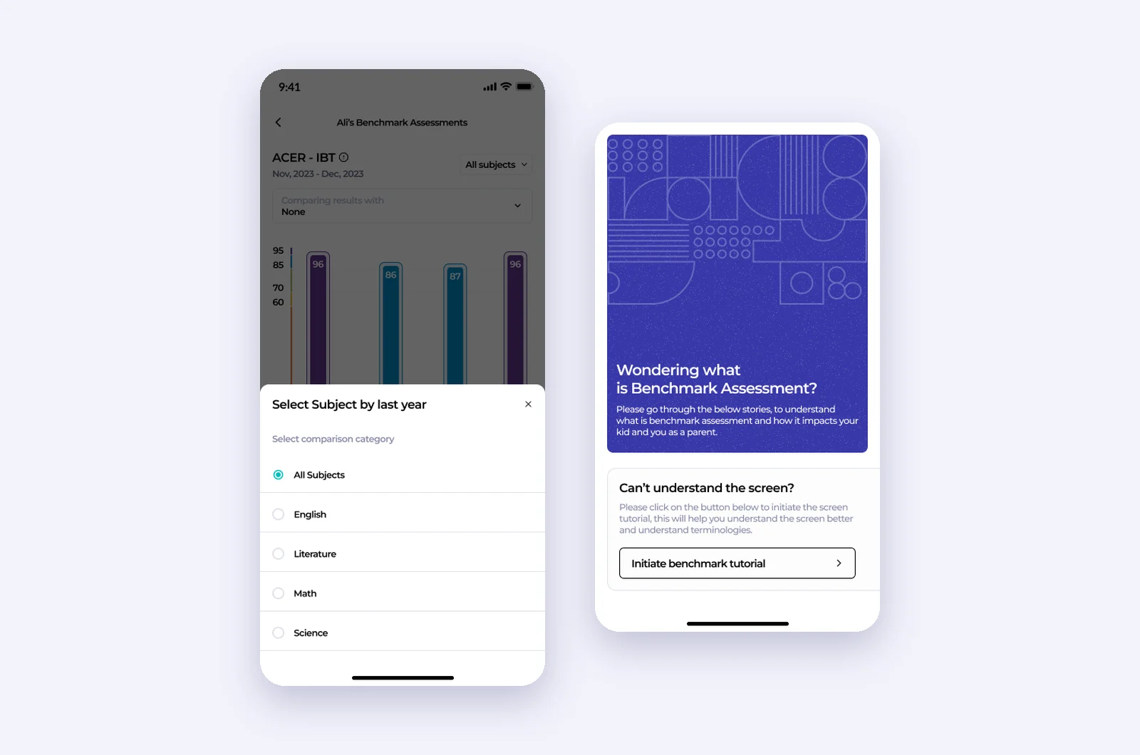
Compare, and learn what it means
Subject selection and the benchmark explainer.
Parents choose which subject to compare. At the bottom, a story-style card explains what a benchmark assessment is, and a guided tutorial walks through the screen for parents seeing it for the first time.
- Subject picker for comparisons
- Story-focused explainer
- A tutorial for the screen itself
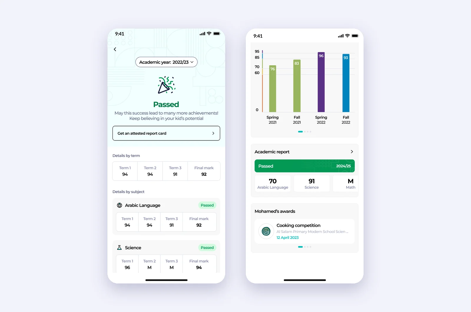
Reports that celebrate, and explain
Academic report and the kid dashboard view.
The academic report opens on the result, with a celebration for a pass, then shows marks by term and by subject. States cover passed, failed, in progress, locked and just started, with and without term breakdowns, so every parent sees an honest version of their child's year.
- Result first, details after
- Marks by term and by subject
- States for every point in the year
Chapter 4
Beyond the classroom.
Rayah also helped parents with everything around school: things to do, news that matters, trusted tutors, and managing the family's profiles.
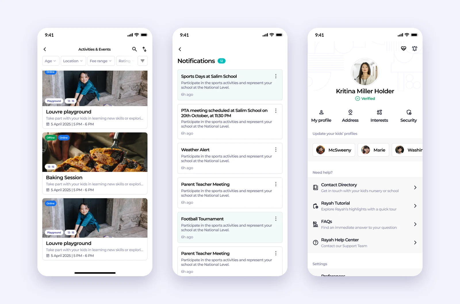
Events, updates and a tidy More
Activities and events, notifications, and the redesigned More.
Events are filtered by age, location, fee range and rating. Notifications group school updates, alerts and meetings. The redesigned More puts the parent's profile and their kids on top, then help, settings and information about Rayah and ADEK.
- Events filtered by age and budget
- School updates in one feed
- More grouped by intent
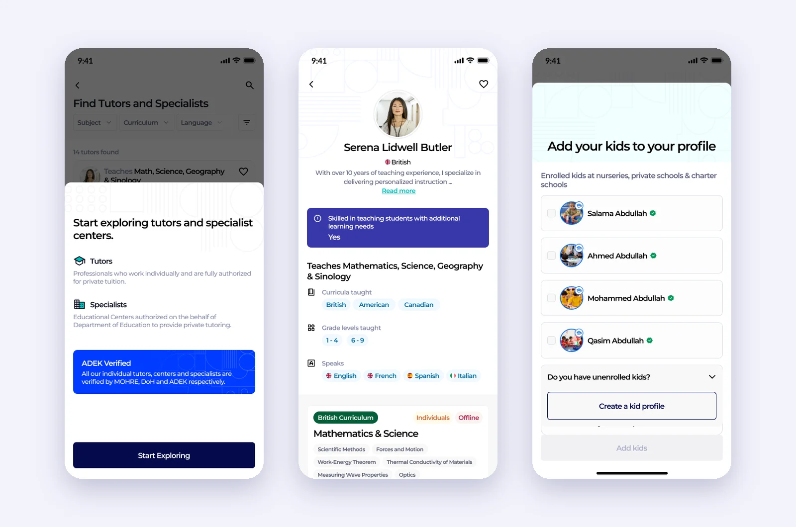
Trusted tutors, and every child added
Tutors and specialists, a tutor profile, and adding kids.
Parents explore tutors and specialist centres that are verified by MOHRE, the Department of Health and ADEK. A tutor profile shows curricula, grades, languages, support for students with additional learning needs, and each session with its price. Adding kids pulls them from school records, so parents confirm instead of typing.
- Only verified tutors and centres
- Sessions with price and format
- Kids added from official records
Chapter 5
A web front door, and a graceful exit.
Rayah reached parents on the web too. When ADEK moved parent services into TAMM, the last design job was to hand people over without losing them.
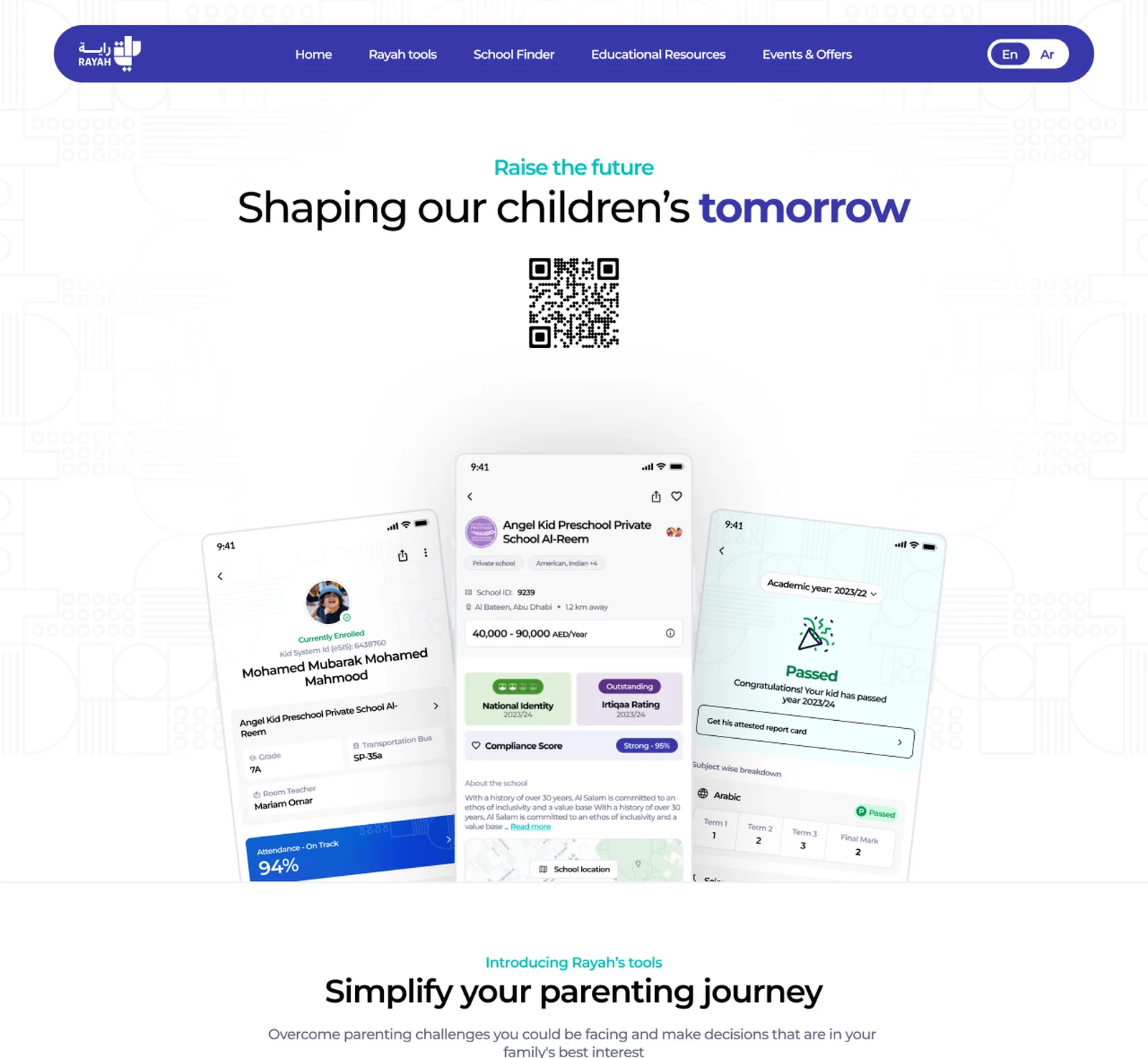
Shaping our children's tomorrow
The Rayah web landing page.
The landing page introduces Rayah's tools, school finder, academic reports and events, with a QR code to download the app, in English and Arabic.
- Every tool introduced in one scroll
- QR code to download
- English and Arabic
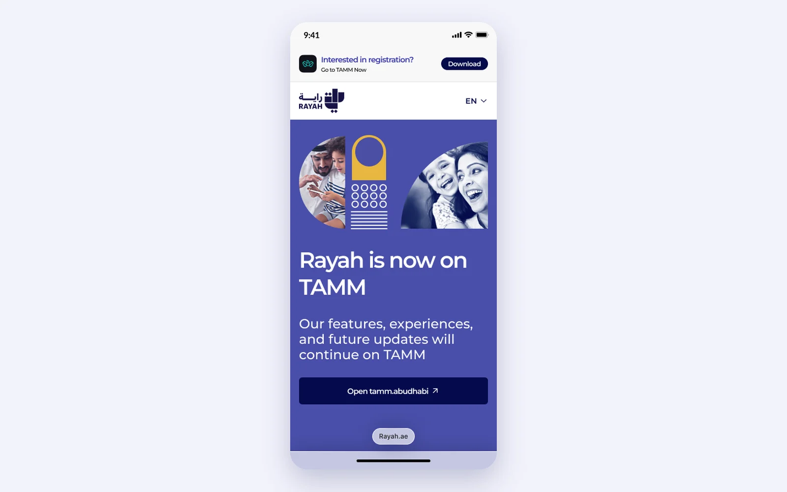
Rayah is now on TAMM
The decommission notice, in the app and on the web.
When Rayah moved into TAMM, a blocker screen and web banner told parents where to go, in both languages, with one action to open TAMM. It is a small screen, but it decides whether years of trust follow the product to its new home.
- One clear action: Open TAMM
- App, web and banner versions
- English and Arabic
Outcomes
Reflection
Rayah taught me that a parent app is really a translation layer. Inspection ratings, assessment percentiles and fee schedules are written for institutions; parents need to know what they mean for their child. The best work here was not adding features, it was deciding what each number should say in plain words, and being honest when the data was not there yet.