ADEK Design System
ADEK
One design system for every ADEK product: designed in Figma, shipped as code for React and Angular, and documented in one place both designers and developers use.
- Role
- Design systems lead, end to end and governance
- Organisation
- ADEK, Department of Education and Knowledge
- Timeline
- 2026, ongoing
- Deliverables
- Figma libraries, adek-ui on npm, docs site
- Users
- ADEK designers, developers and vendors
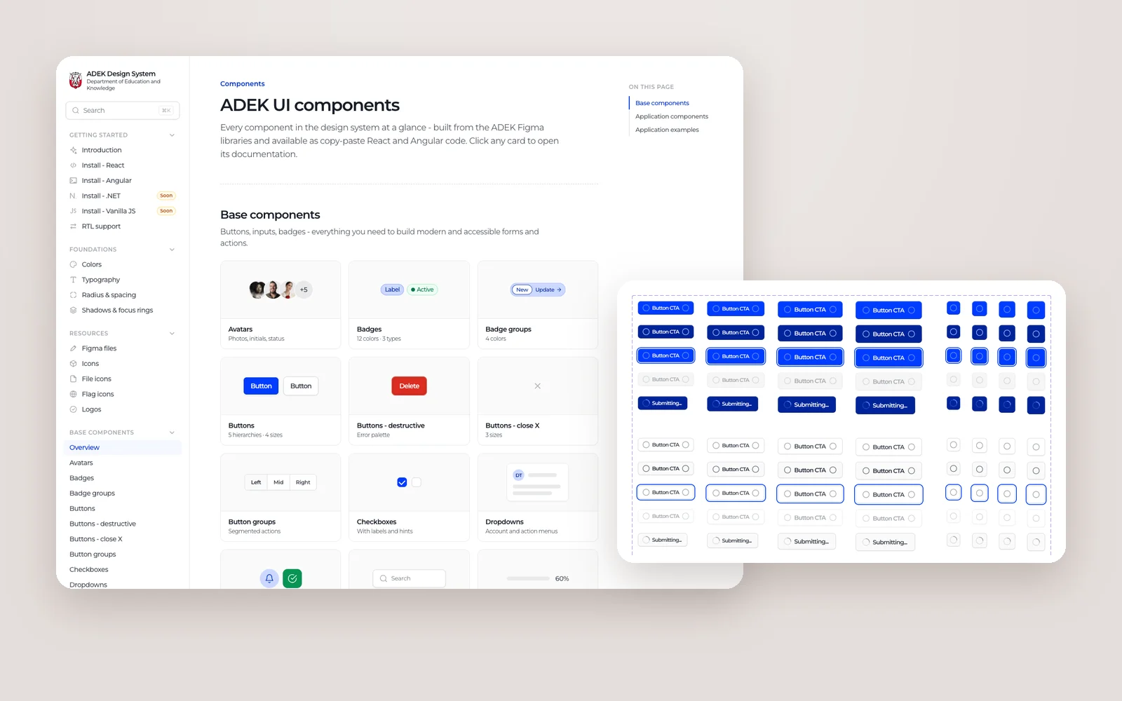
Overview
ADEK builds many products for schools, parents, inspectors and staff, often with different vendors. Without a shared system, every team rebuilt the same buttons, tables and forms in slightly different ways, and every product drifted a little further from the brand.
The ADEK Design System fixes that at the source. The Figma libraries hold the foundations and components. A single CSS layer turns them into code shared by React and Angular, published as the adek-ui package. The documentation site shows every component with live previews and code to copy. I own all three, and the rules for how they change.
What I owned
- Foundations in Figma: colour, typography, spacing, radius, grids and effects, built as variables with light and dark modes.
- Base components (buttons, inputs, dropdowns, toggles, avatars, tooltips and more) and 26 pages of application components, from page headers to tables and calendars.
- The code: one token and CSS layer shared by both frameworks, and the adek-ui Angular package with an ng add schematic, published on npm.
- The documentation site: getting started for React, Angular and RTL, foundations, resources, and a page for every component with preview and code.
- Governance: file structure, naming, what gets published, versioning, and how Figma and code stay in sync.
A design system is only as good as its weakest handover. The work is making Figma, code and docs say exactly the same thing.
Objectives → Design framing
How might every ADEK product draw colour, type and spacing from the same variables, instead of copying values by hand?
How might a component look the same in Figma, in React and in Angular, without three teams maintaining three versions?
How might a new vendor go from zero to a correct ADEK screen in an afternoon?
Key constraints & tradeoffs
ADEK products are built in both React and Angular. The system had to serve both without doubling the work or letting them drift apart.
Every component had to work right to left, with SF Arabic as the Arabic companion to Montserrat.
Colour pairs are checked against WCAG 2.2 contrast ratios, and every interactive element has a visible focus ring.
External teams build ADEK products. The system had to be self-serve: libraries, packages and docs they can use without a meeting.
How objectives translated to features
Hard-coded hex values are how brands drift. Variables make the right choice the easy one.
Design decisions- 409 primitive variables for raw values, and 303 semantic colour variables with light and dark modes on top.
- Separate collections for spacing, radius, widths, containers and typography, so each has one job.
- Electric Blue as the brand, with Sand and Light Gray scales, each swatch labelled with its contrast score.
- 44 text styles and 24 effect styles, named the same way in Figma and in code.
Two layers of variables take longer to set up than a flat palette. They are what make dark mode and future rebrands a change of values, not a redesign.
Solution
Layer 1
Designed in Figma.
Everything starts in two libraries: Core, with foundations and base components, and Applications, with the larger patterns products are built from.
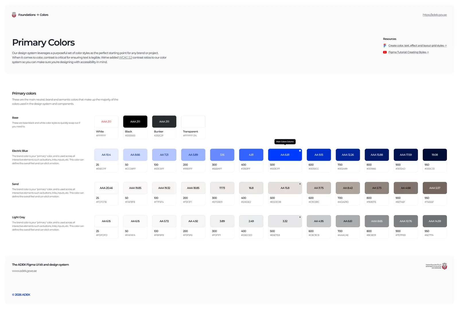
A brand in variables
Electric Blue, Sand and Light Gray, each with its contrast ratio.
The primary colours page documents the brand as scales from 25 to 950, with every swatch labelled with its WCAG contrast score, so designers can see at a glance which pairs are safe for text.
- Scales from 25 to 950
- Contrast score on every swatch
- Backed by light and dark mode variables
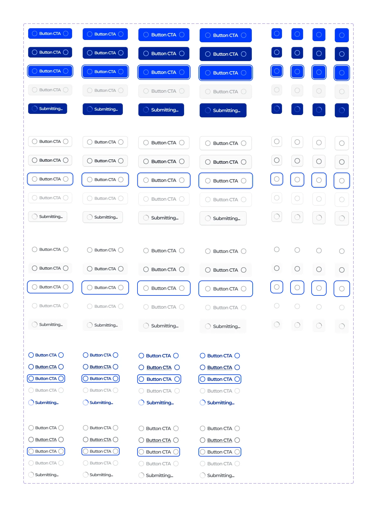
Every state, every size
Buttons across hierarchies, sizes and states, including loading.
Components are built as full variant sets: primary, secondary, tertiary and link hierarchies, four sizes, icon-only versions, and default, hover, focus, disabled and loading states. Designers pick; they never redraw.
- Hierarchy, size and state as properties
- Focus rings built into the component
- A loading state with a Submitting label
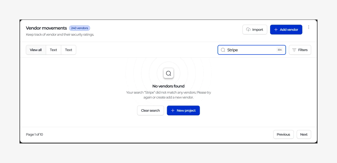
Application patterns, not just atoms
Tables, modals, charts, calendars and 22 more pages.
The application library covers what products are actually made of: page and card headers, navigation, tables, modals, command menus, charts, empty states and more. Each one is assembled from the base components, so a change to a button flows everywhere.
- 26 pages of application components
- Built from base components
- Empty, loading and error states included
Layer 2
Shipped as code.
The same tokens and component styles serve React and Angular, so a product built by any team, in either framework, matches the Figma file.
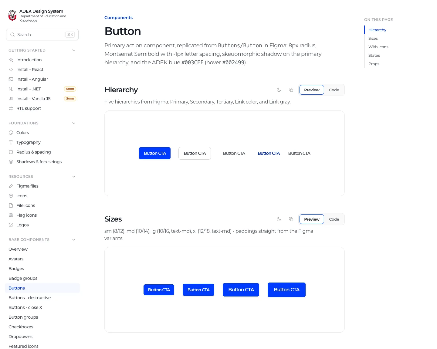
Preview and code, side by side
Each component with its variants, previews and React and Angular code.
The button page walks through hierarchy, sizes, icons and states, each with a live preview and a code tab. The values are taken straight from the Figma variants, down to the padding and focus ring.
- Live preview for every variant
- React and Angular code tabs
- Specs stated from the Figma source
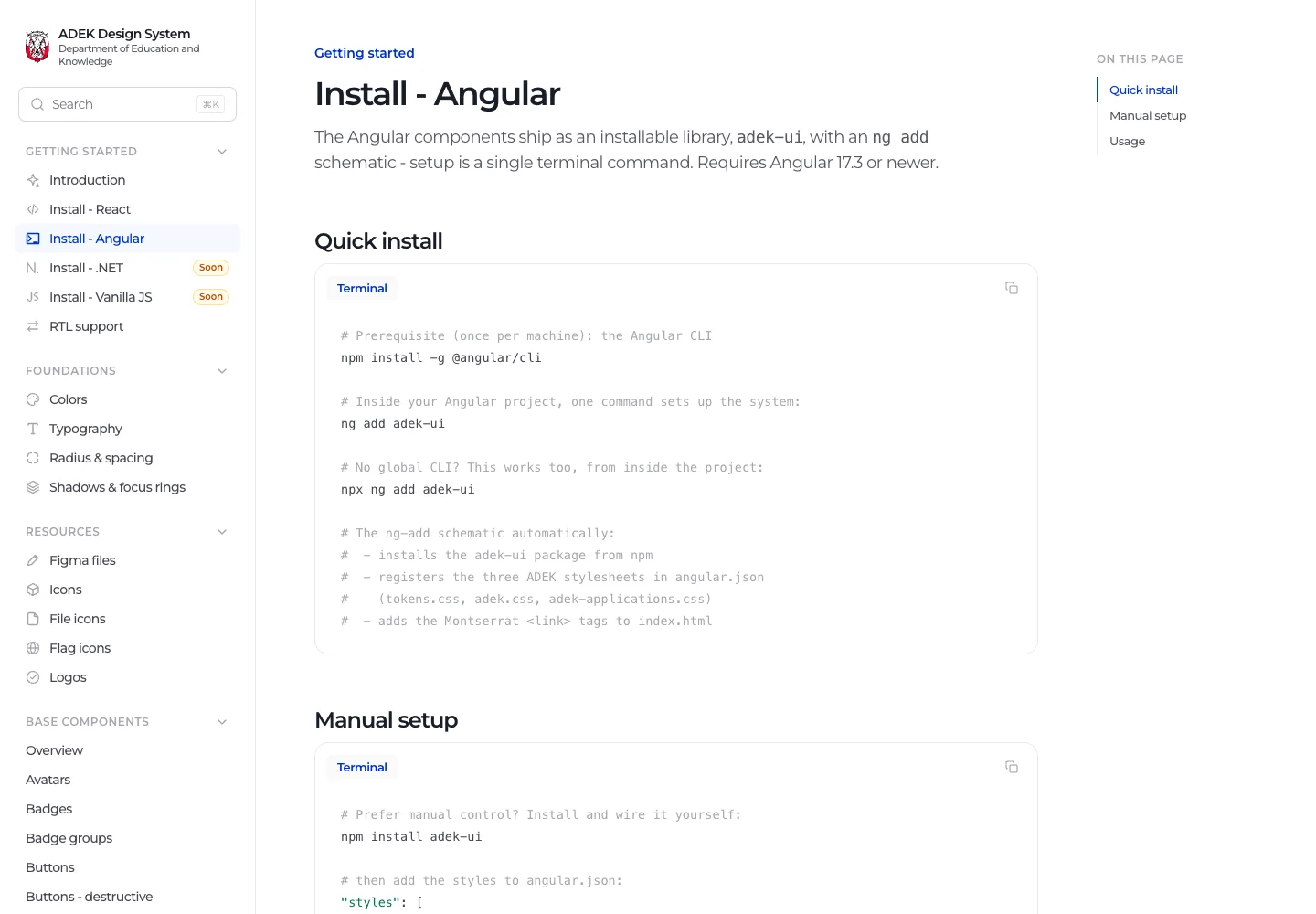
One command to start
ng add adek-ui installs the package, styles and fonts.
Angular teams install the system with one command. The schematic adds the package, registers the stylesheets and adds Montserrat to the project, and every component is a standalone import.
- ng add schematic
- Standalone components
- Manual setup documented too
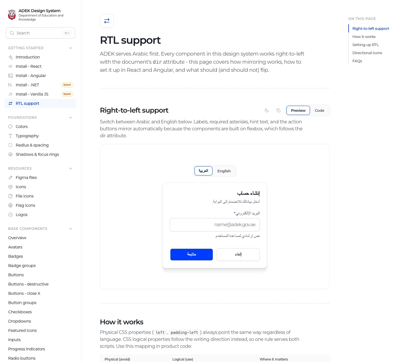
Right to left, by design
Arabic and English from the same components.
The RTL guide shows the same form in Arabic and English and explains how components use logical CSS properties, so layouts mirror with the document direction instead of needing a second version.
- Live Arabic and English toggle
- Logical properties instead of left and right
- SF Arabic as the Arabic typeface
Layer 3
Documented in one place.
The docs site is where designers, developers and vendors meet: what the system is, how to install it, and every component with code.
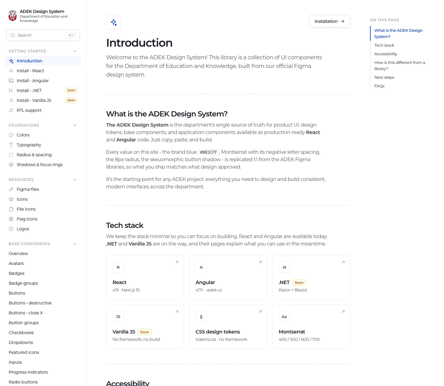
Start here
What the system is, the tech stack, accessibility and next steps.
The introduction explains the system in plain language, lists the supported stacks (React, Angular, CSS tokens, with .NET and vanilla JavaScript coming), and sets accessibility as the baseline for government services.
- Supported stacks at a glance
- Accessibility as a baseline
- How it differs from a library
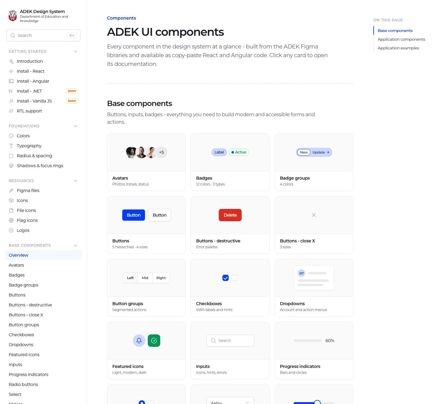
Everything at a glance
Every base and application component on one page.
The overview renders every component as a small live card, so people browse visually and click through to the full page, instead of guessing names in a sidebar.
- Live thumbnails, not screenshots
- Base and application components
- One click to the full page
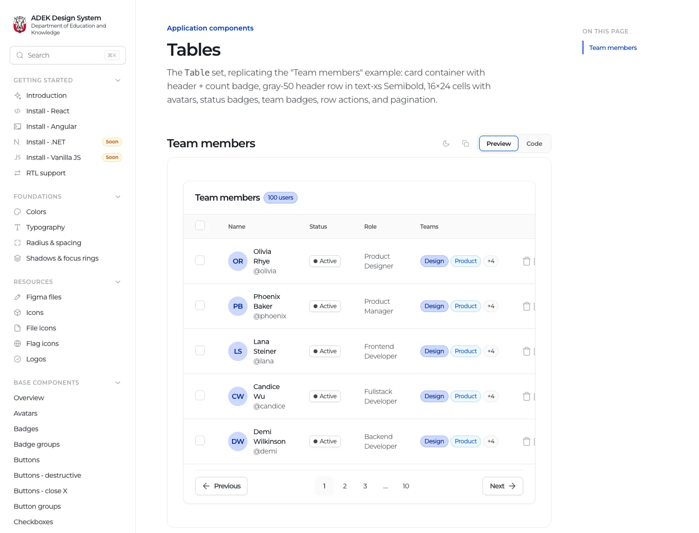
Real patterns, ready to copy
Application components with realistic content.
Application components are documented with realistic examples, like a team members table with avatars, statuses, badges and pagination, so teams copy a working pattern rather than assembling one from parts.
- Realistic example content
- Preview and code
- Built from the same base components
Outcomes
Reflection
The hardest part of a design system is not the components, it is keeping promises. When the docs say a button has 8px radius and a Semibold label, that has to be true in Figma, in React and in Angular, today and after the next release. Leading the system end to end taught me that governance is mostly that: making sure every layer tells the same truth.