Khotwa (RizeUp)
ADEK
A second chance at a university degree abroad, explained so clearly that an Emirati student can tell in one scroll whether it is for them.
- Role
- Product designer, end to end
- Organisation
- ADEK, Khotwa (RizeUp) programme
- Timeline
- 2023 to 2024
- Platform
- Website, desktop, tablet and mobile
- Audience
- UAE National students and their families
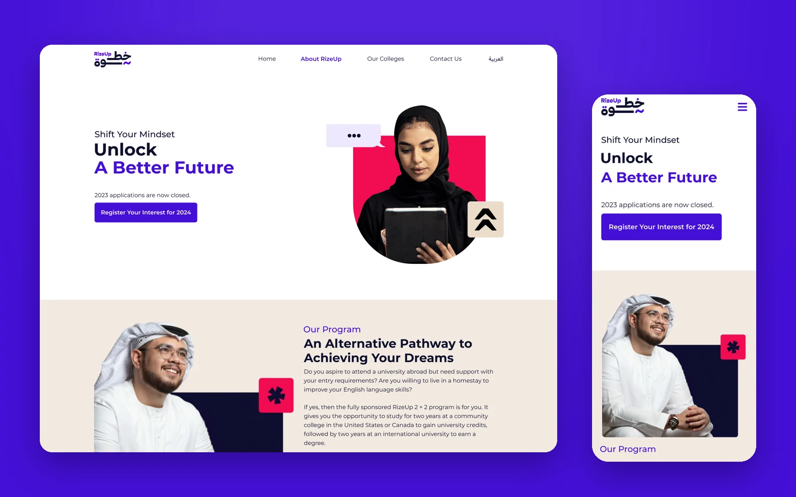
Overview
Khotwa, known in English as RizeUp, is ADEK's fully sponsored 2 + 2 programme. Students spend two years at a community college in the United States or Canada to earn university credits, then two years at an international university to finish their degree, with up to a year of English training and a homestay with a local family.
It is designed for students who have not yet reached their potential, which makes the website's job delicate. It has to be encouraging without overpromising, and precise about who qualifies. I designed it to answer a student's questions in the order they ask them: is this for me, what happens next, and where would I go?
What I owned
- The home page: hero, programme story, eligibility, application journey, colleges, homestay partners, handbooks and FAQs.
- The About RizeUp and Our Colleges pages, with filters by country.
- Every page at 1440, 1024 and 390, with a mobile side menu.
- A sub-design system for the site: typography, spacing and card states, built on the RizeUp brand.
- A design review of the Policy AI chatbot, with fixes for typography, Arabic support and controls.
For a student who needs a second chance, the first page should feel like an open door, not an entrance exam.
Objectives → Design framing
How might a student check whether they qualify without reading a handbook or calling an advisor?
How might a year of application, assessment and preparation read as a few clear steps with dates?
How might colleges and homestays feel concrete enough that a student and their family can picture it?
Key constraints & tradeoffs
Grade averages, an IELTS score and a homestay commitment are firm requirements, but the audience is students looking for a second chance. The copy and layout had to be exact and encouraging at once.
Colleges in the United States and Canada and three homestay networks needed one consistent way to be browsed and compared.
Students browse on their phones. Every section, from the journey timeline to the FAQs, had to work at 390 pixels, not just shrink.
RizeUp has its own violet, magenta and warm beige, and sits alongside ADEK's identity in the footer and handbooks.
How objectives translated to features
Students who do not qualify lose time, and students who do qualify often assume they do not.
Design decisions- Four yes or no questions on the home page, written the way a student would ask them.
- Exact thresholds in the copy: Grade 11 and Grade 12 averages, and a minimum IELTS score.
- Register Today placed directly under the checklist, so a yes leads straight to action.
- The hero says plainly when applications are closed and invites students to register interest for the next intake.
Showing the criteria this early will turn some students away. It is kinder than letting them apply and wait months for a no.
Solution
Question 1
Is this for me?
The home page opens on hope and then gets specific fast: what the programme is, who qualifies and what the next year looks like.
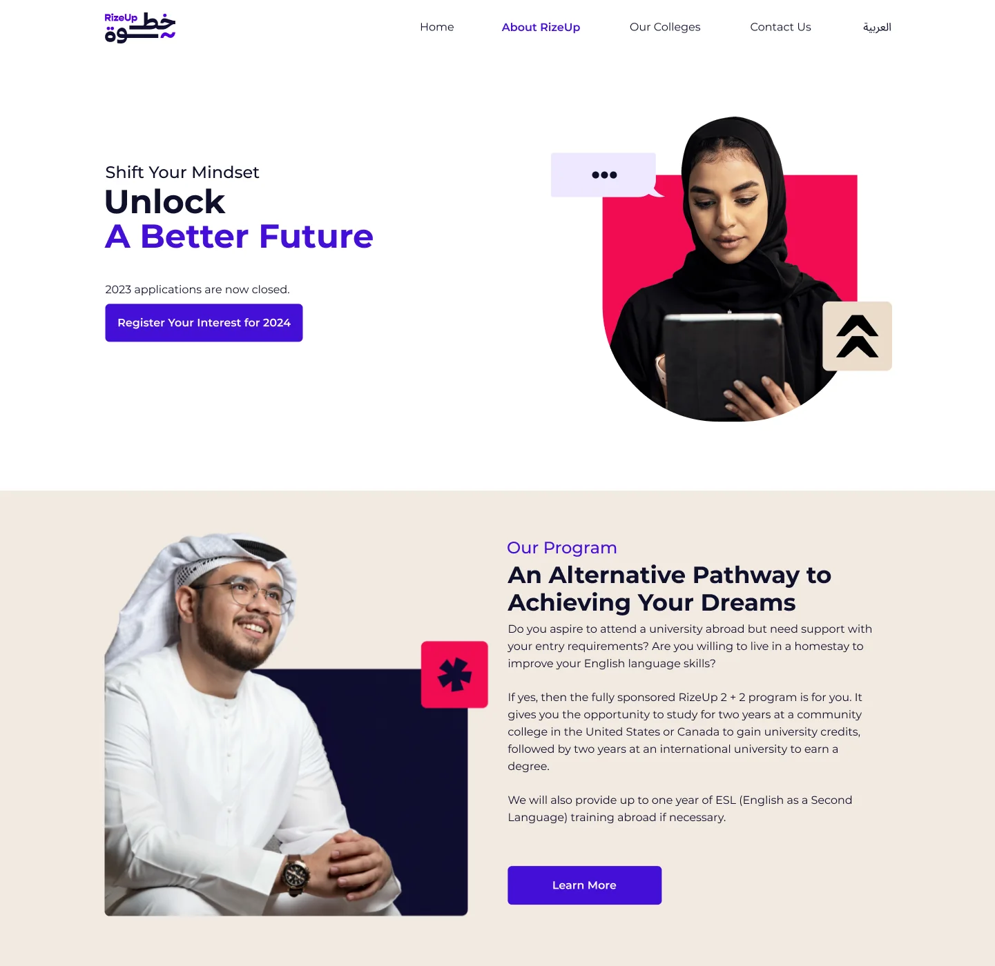
Unlock a better future
An open door, then the programme in plain words.
The hero speaks to mindset before criteria, and states honestly when applications are closed. The next section explains the fully sponsored 2 + 2 pathway: two years at a community college in the United States or Canada, then two years at an international university.
- Register interest when applications are closed
- The 2 + 2 model in one paragraph
- RizeUp violet, magenta and beige throughout
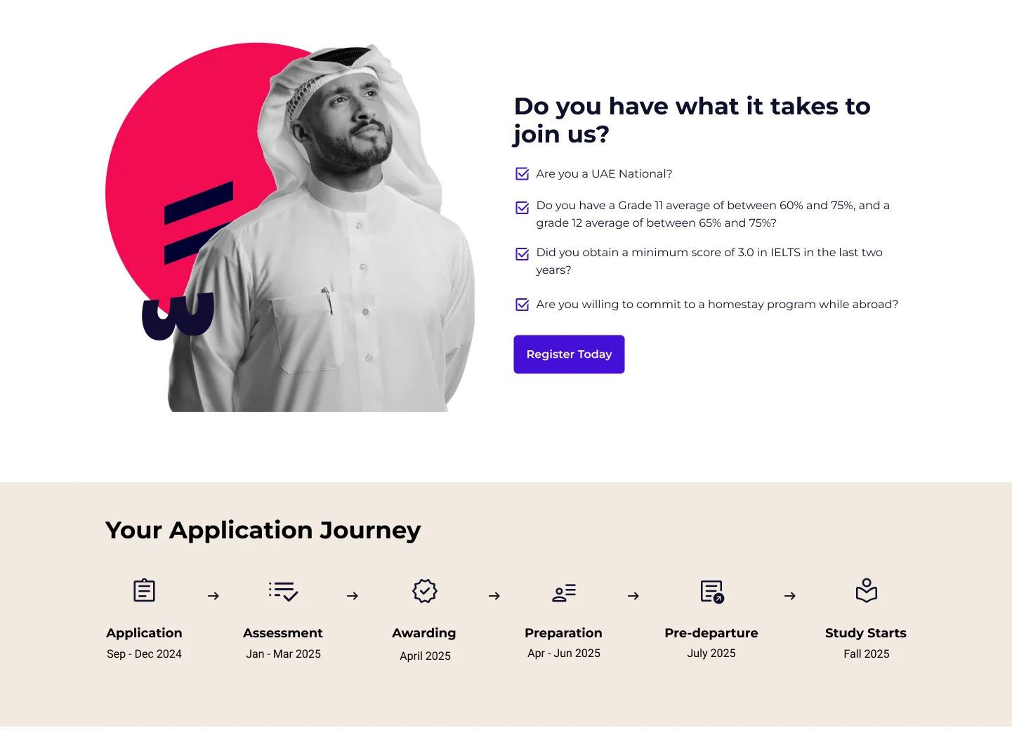
Do you have what it takes?
Four questions, then six dated stages.
Eligibility is a checklist a student can answer alone. Directly below, the application journey runs from application in September to study starting the following fall, with the months for every stage in between.
- Exact grade and IELTS thresholds
- Register Today right after the checklist
- Six stages, each with its months
Question 2
Where would I go?
Going abroad for four years is a family decision. These pages make the colleges, the homestay and the fine print concrete.
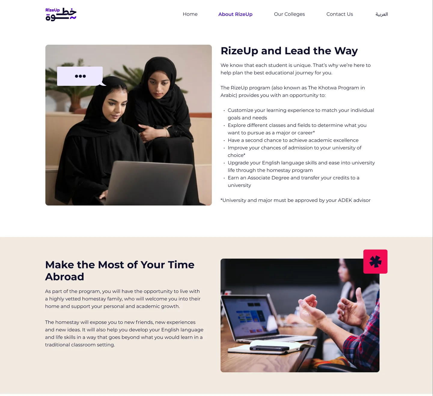
RizeUp and lead the way
What the programme offers, and life with a homestay.
The about page explains the programme's promise in a short list, from exploring majors to earning an associate degree and transferring credits, and notes that the university and major must be approved by an ADEK advisor. A second section introduces the homestay as part of the learning, not just a place to sleep.
- Benefits as a scannable list
- The advisor approval rule stated clearly
- Homestay framed as growth
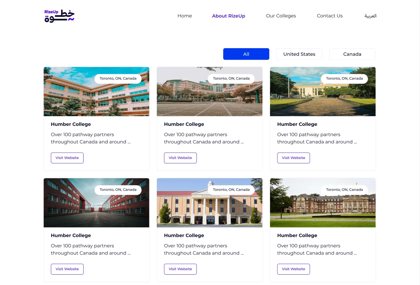
Colleges, by country
Filter by United States or Canada; every card links out.
Colleges are cards with a photo, location, a short description and a link to the college's own website, filtered by country. The same card appears on the home page as a preview of the full list.
- All, United States and Canada filters
- Location on every photo
- Visit Website on every card
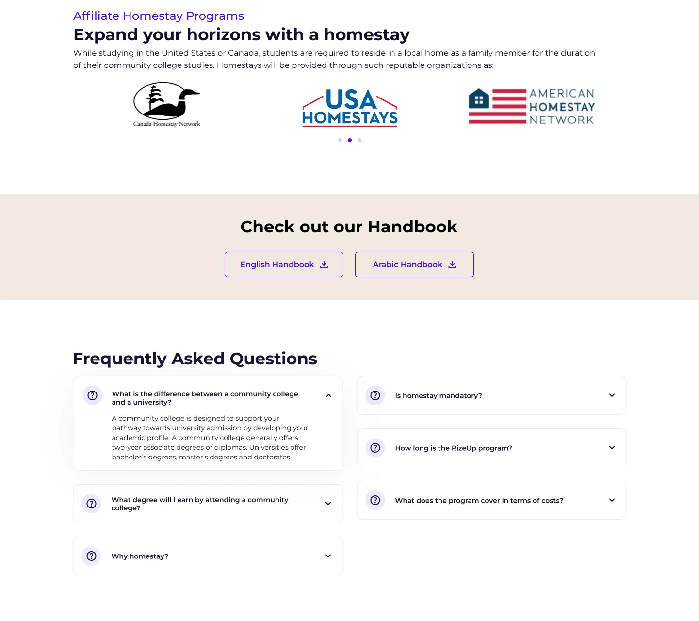
Homestay, handbooks and answers
Partner networks, two handbooks, and the questions families ask.
The home page closes with the homestay partners (Canada Homestay Network, USA Homestays and American Homestay Network), handbooks to download in English and Arabic, and FAQs that answer the real worries: community college or university, which degree, why homestay, how long, and what it costs.
- Three named homestay networks
- English and Arabic handbooks
- FAQs written from students' questions
Every screen
In a student's pocket.
Every page was designed at 1440, 1024 and 390, because most students will meet RizeUp on a phone.
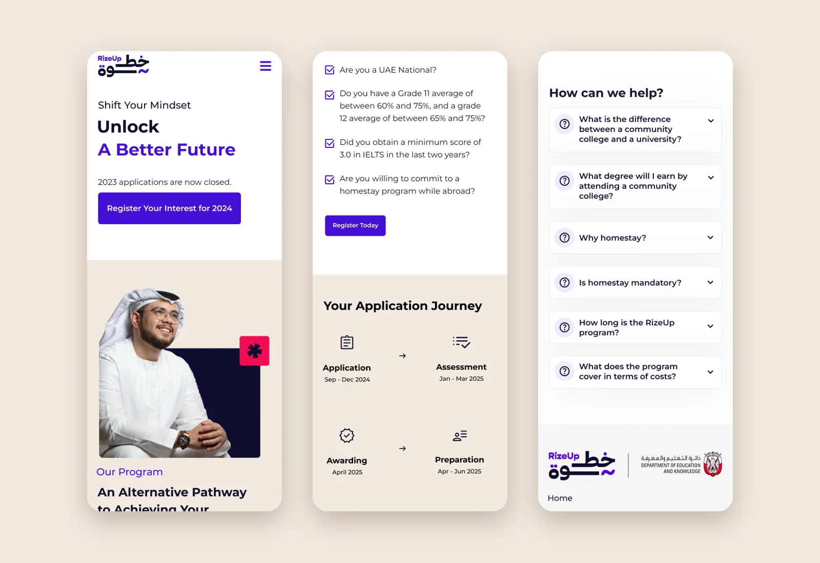
The same story, one thumb away
Hero, eligibility and FAQs at 390 pixels.
On mobile, the navigation folds into a side menu, the eligibility checklist keeps its full wording, the journey becomes a two-column grid, and the FAQs become full-width cards. Nothing is cut for the small screen.
- Side menu for navigation
- Journey as a two-column grid
- Full FAQs, no hidden content
Outcomes
Reflection
Designing for students who need a second chance changed how I thought about criteria. Hiding the requirements would have felt friendlier for a moment and crueller in the end. The kindest version of this site states the rules clearly, early and in a warm voice, and then makes everything after them feel possible.