Amend School Contact Details
ADEK on TAMM
Updating a school's phone number should not feel like applying for a new licence. On TAMM it is one page: pick the school, edit what changed, confirm and pay.
- Role
- Product designer, service design and design QA
- Organisation
- ADEK on TAMM, Abu Dhabi Government
- Timeline
- 2026
- Service
- ADEK/0035 Amend Private School Contact Details
- Users
- Private school investors and operators
Overview
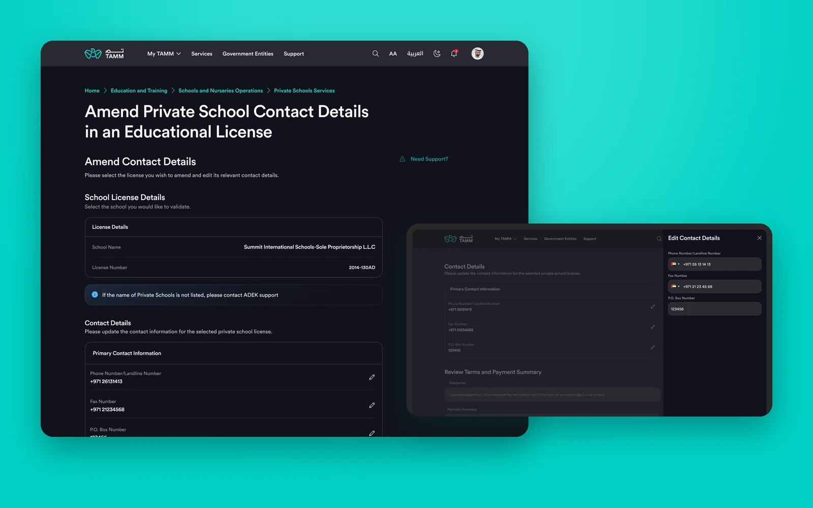
Every private school in Abu Dhabi holds an education licence from ADEK, and the licence carries the school's official contact details: landline, fax and P.O. box. When they change, the school must amend the licence. On TAMM, this is service ADEK/0035, available only through TAMM.
The change itself is small, so the service had to be small too. I designed it as a single page on TAMM's design system: the school is selected first, its licence details are shown read-only, each contact field is edited in place, and terms, payment summary and the main action close the page. A dashboard around it keeps every past application one click away.
What I owned
- The applications dashboard with the selected school, New Application, and a searchable history of applications.
- The Select School slide-out for investors with more than one school.
- The single amendment page: read-only licence details, editable contact details, terms and payment summary.
- The Edit Contact Details slide-out, payment failure, and the completed, rejected and ineligible outcomes, on web and mobile.
- The single-page implementation notes for the build team, and design review of the stage builds with and without payment.
The size of a service should match the size of the change.
Objectives → Design framing
How might a three-field update take one page instead of a multi-step application?
How might a school see what it has already submitted before it starts again?
How might the design survive implementation by a separate team, with TAMM's components and rules?
Key constraints & tradeoffs
The service had to follow TAMM's templates and toolkit: dashboard, slide-outs, disclaimer, payment summary and outcome pages.
Some amendments carry a fee and some do not, so every screen needed a version with payment and one without.
Investors may own several schools. Choosing the right licence had to be quick and impossible to get wrong.
Components the design relied on might not be feasible in the build, so the design had to name its fallbacks.
How objectives translated to features
Schools amend contact details more than once. Without history, they cannot tell whether a change is already in progress.
Design decisions- The selected school and its licence number sit at the top, with Select Account to switch.
- New Application as the single primary action.
- An applications table with status, submission date, reference number and actions, filterable and searchable by reference.
- A Select School slide-out that lists every licence the investor holds.
An extra screen before the form. It prevents duplicate applications and gives the service a home to come back to.
Solution
Part 1
Start from the school.
The service opens on a dashboard for the selected school, so the investor sees what has already been submitted before starting something new.
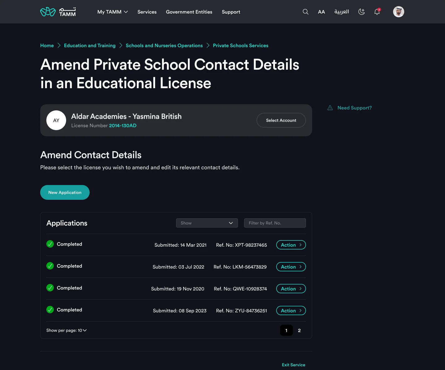
Your school and its applications
Selected licence, New Application, and application history.
The selected school and its licence number sit at the top. Below, New Application starts a change, and the applications table lists every request with its status, date and reference, with filters and search.
- Selected school always visible
- One primary action
- History searchable by reference
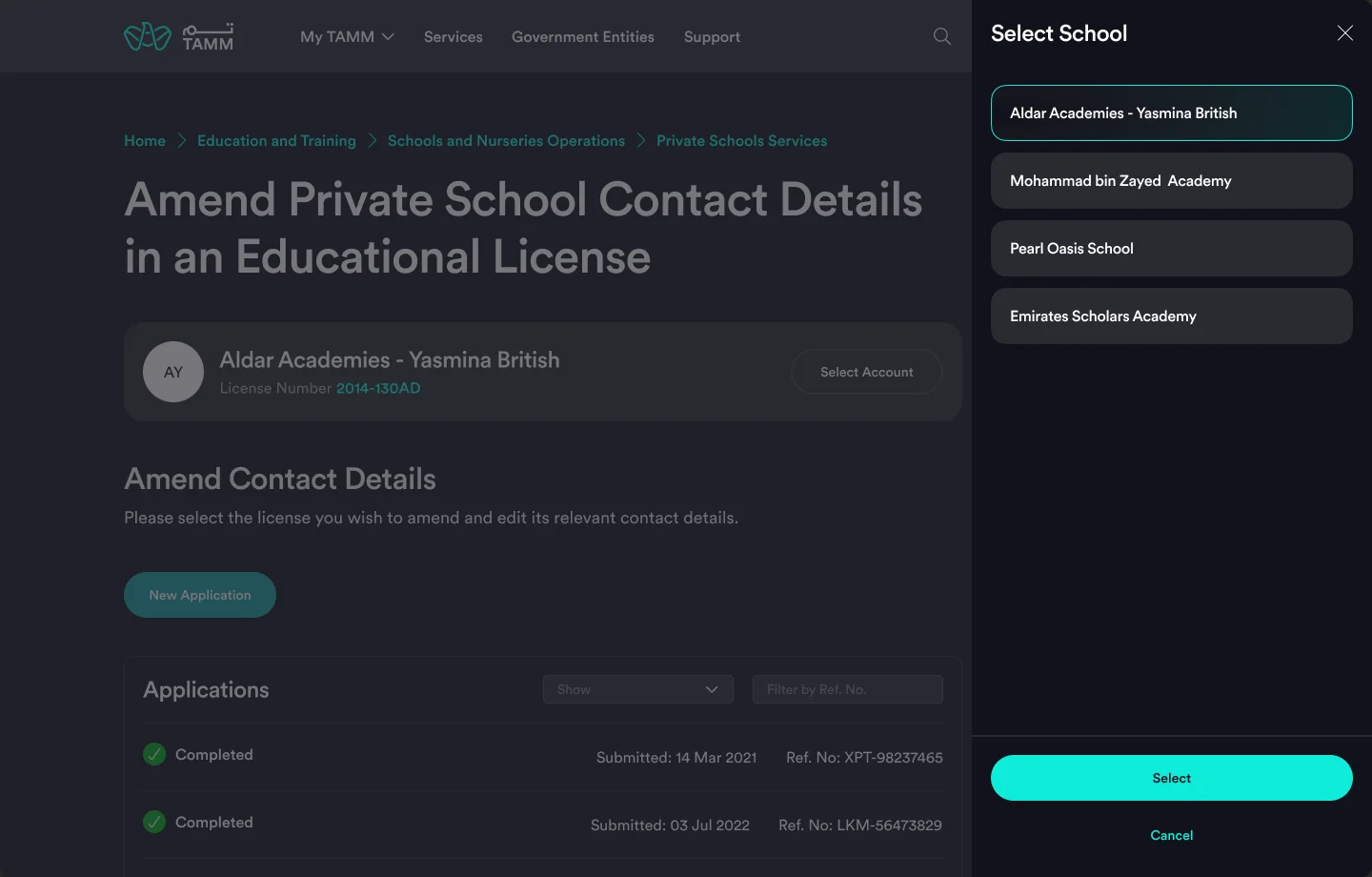
Switch schools in a slide-out
Every licence the investor holds, one tap away.
Investors with several schools switch licence from a slide-out instead of a separate page, so the dashboard stays in view and the choice is explicit.
- All the investor's schools listed
- Select and Cancel only
- Context kept behind the panel
Part 2
Change only what changed.
The amendment is one page: confirm the licence, edit the contact fields that changed, accept the terms and pay if needed.
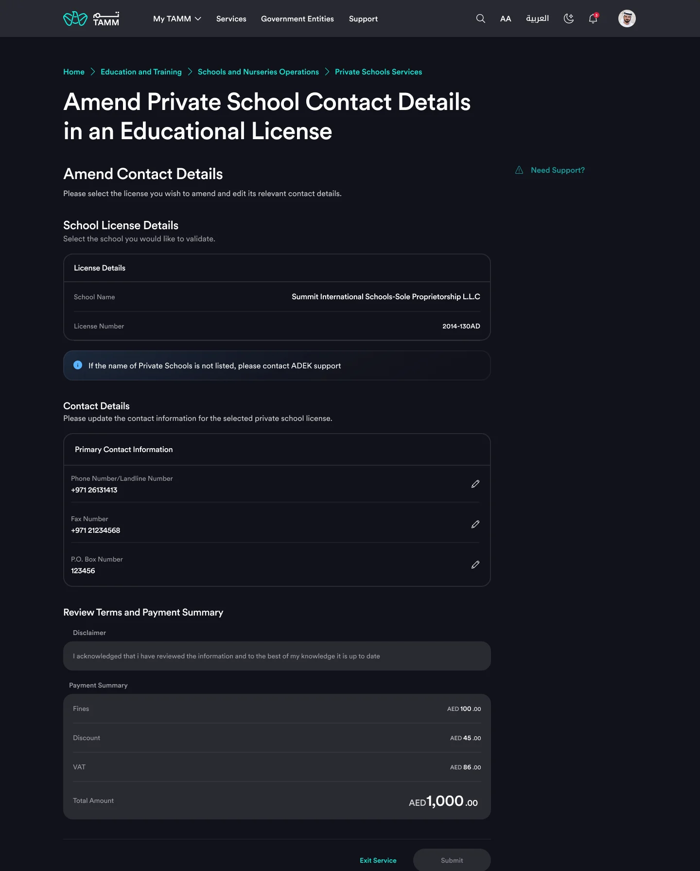
One page, in the right order
Licence details, contact details, terms and payment summary.
The licence is shown read-only so the investor can confirm the school. Contact details list the current landline, fax and P.O. box, each with an edit icon. Terms and the payment summary close the page with the main action.
- Read-only licence to confirm the school
- Current values visible before editing
- Payment summary only when a fee applies
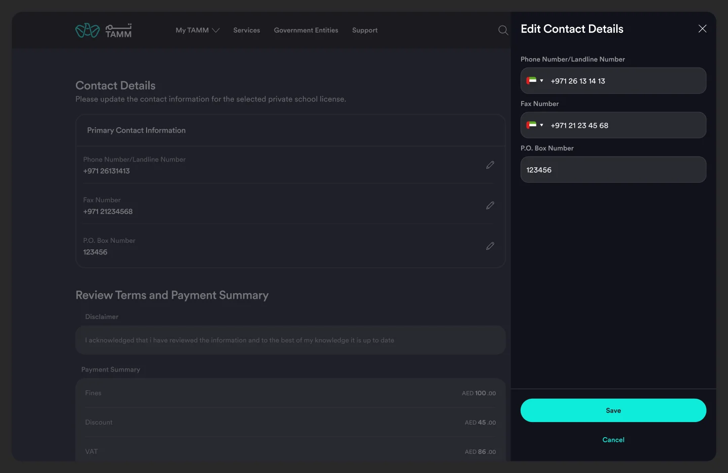
Edit Contact Details
A slide-out with country codes, Save and Cancel.
Editing opens a slide-out with the three fields and their country codes. Saving returns to the page with the new values in place, so the investor reviews the whole change before submitting.
- Country code pickers
- All three fields together
- Back to the page on Save
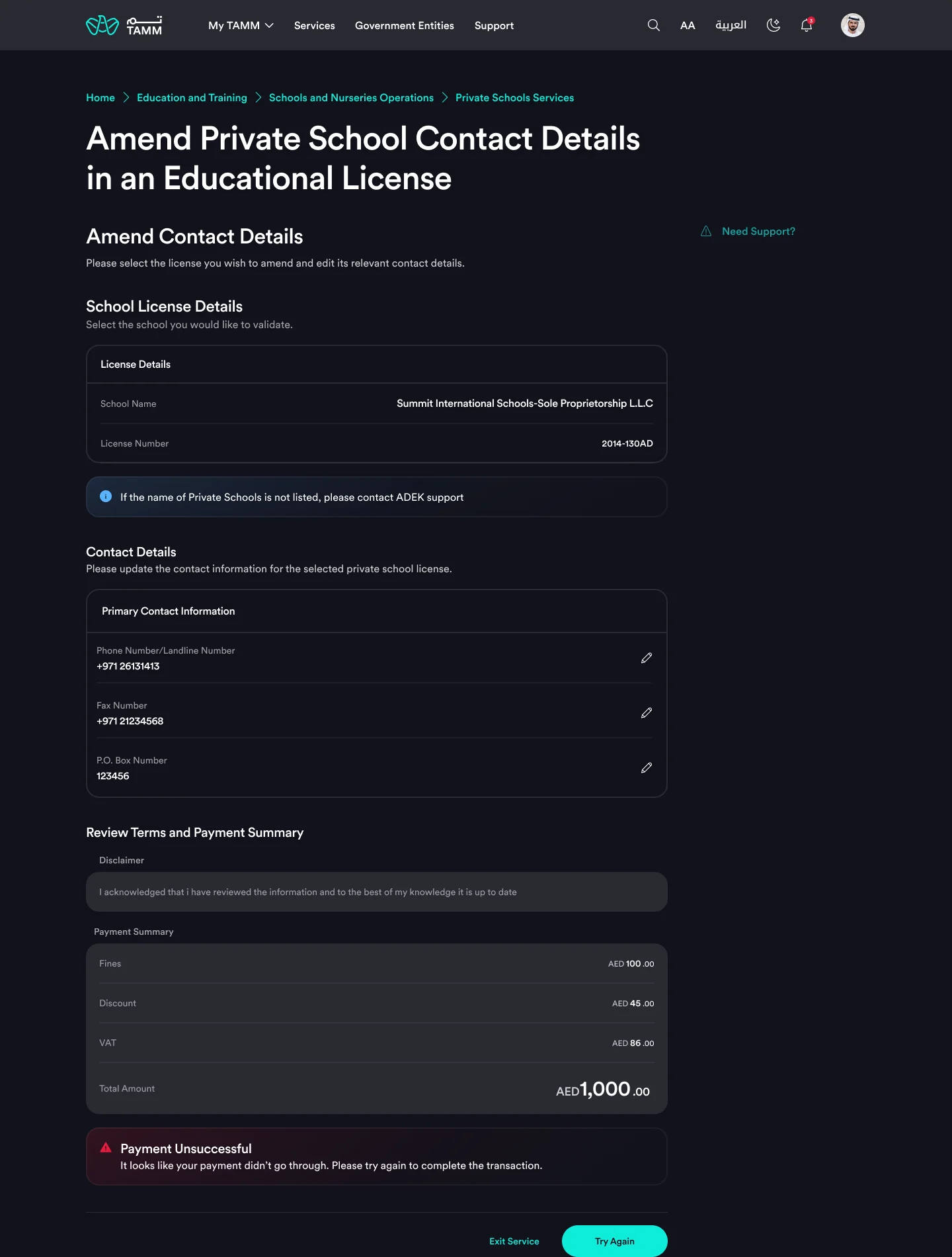
When payment fails
Changes kept, error in place, Try Again.
If payment does not go through, the edited details stay on the page, the error appears above the action, and Try Again replaces Proceed to Pay.
- Nothing to re-enter
- Error next to the action
- One retry action
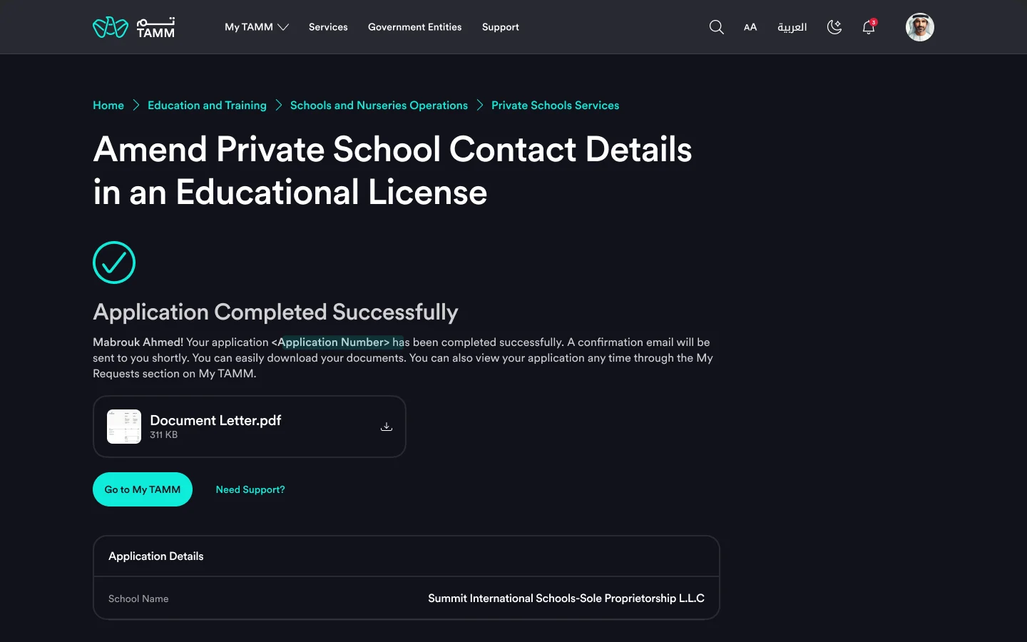
Done, with the letter
The completed outcome with a downloadable document.
When the amendment is approved, the outcome page confirms it, offers the document letter to download, and shows the application details. Rejected and ineligible outcomes follow the same structure, each with its reason.
- Document letter on the page
- Application details for reference
- Same pattern for every outcome
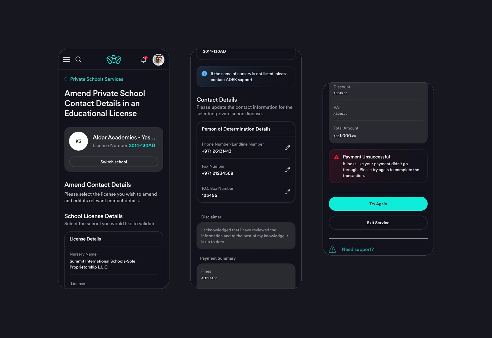
The same page on a phone
School card, contact fields and payment at 375 pixels.
On mobile, the school card gets a Switch school button, contact fields stack with their edit icons, and the payment summary, error and actions follow in the same order as on web.
- Switch school on the card
- Stacked, editable fields
- Same order as web
Part 3
From design to stage.
The build was done by a separate team, so the file carries implementation notes and captures of the stage builds, with and without payment, for review.
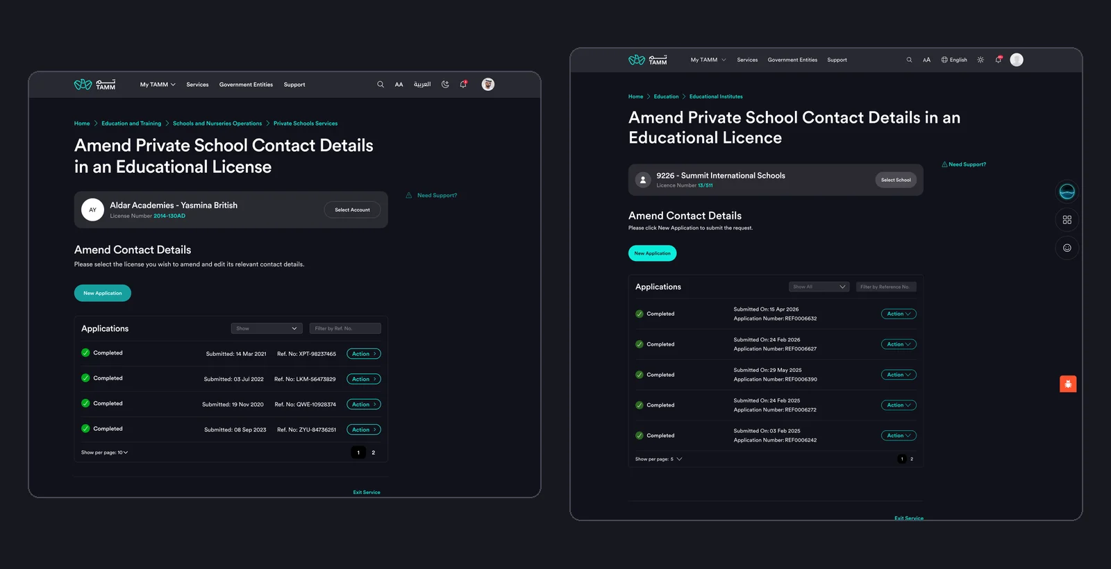
Design and build, side by side
The designed dashboard, and the stage build.
The stage build follows the designed structure: selected school, New Application and the applications table. Reviewing them side by side makes differences in copy, components and spacing easy to point out, and they were logged by TAMM's review categories: design compliance, services, notifications, business, TAMM Care, content and product.
- Design and stage compared screen by screen
- Builds with and without payment
- Issues sorted by review category
Outcomes
Reflection
This service was a lesson in proportion. It would have been easy to reuse a full application template, but a change of phone number deserves a page, not a process. The most useful thing I wrote for it was not a screen but a sticky note: the order the page must follow, and what to use if the ideal component was not available.